Launched November 2018 on iOS devices
In mid-October of 2018, I was referred to the primary developer of Troll Farm by an old coworker. As it turned out, that developer was Aaron Nemoyten, a Software Engineer and Game Designer I have had the pleasure of working with for many years already. There was no doubt in my mind that together we would be able to output a great product in no time at all.
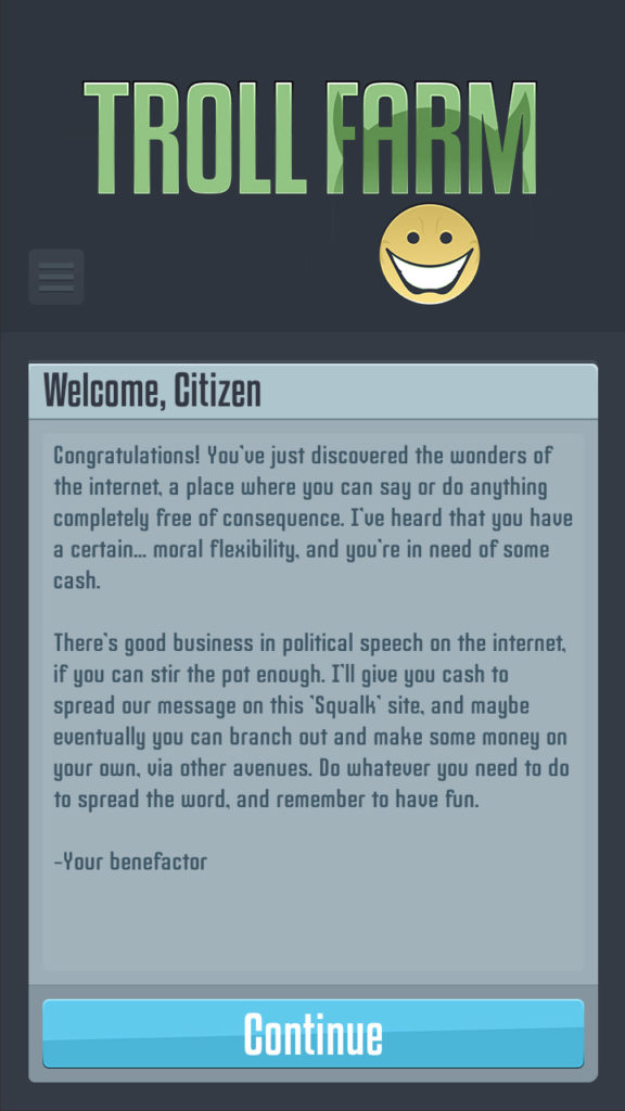
He pitched to me the idea of an “idle game” (also known in the gaming industry as an “incremental game”) that would contrast interactions and content in political satire. While analogous titles such as Adventure Capitalist, Clicker Heroes, and Cookie Clicker offer an endless experience that is comedic, Troll Farm would tell a story from beginning to end that might make you feel like you lived a season of the popular television series, House of Cards.
UI SAMPLES


01. GOALS
Much of the framework and functionality was in place when Aaron brought me on board, but in addition to replacing his placeholder art with a new style guide for the user interface there were some fundamental and visual design decisions that he did not have time to solve on his own:
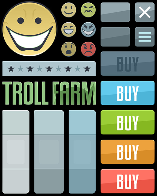
- In contrast to other idle games that appeared too playful in his opinion, Aaron wanted to achieve an aesthetic that complemented the intended dry humor of its content – he expressed a desire for visuals that were clean like a transit map, simple to understand, and less color saturated.
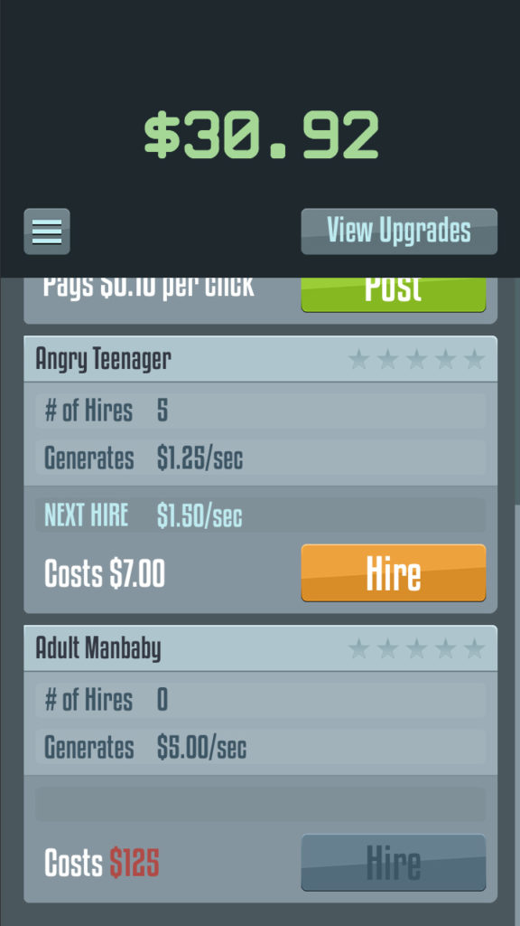
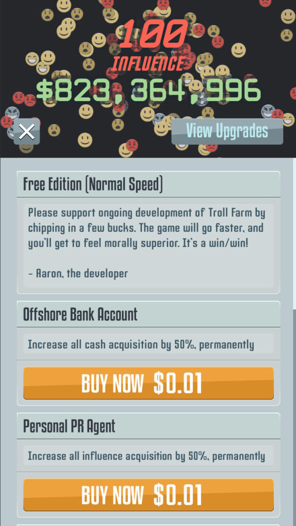
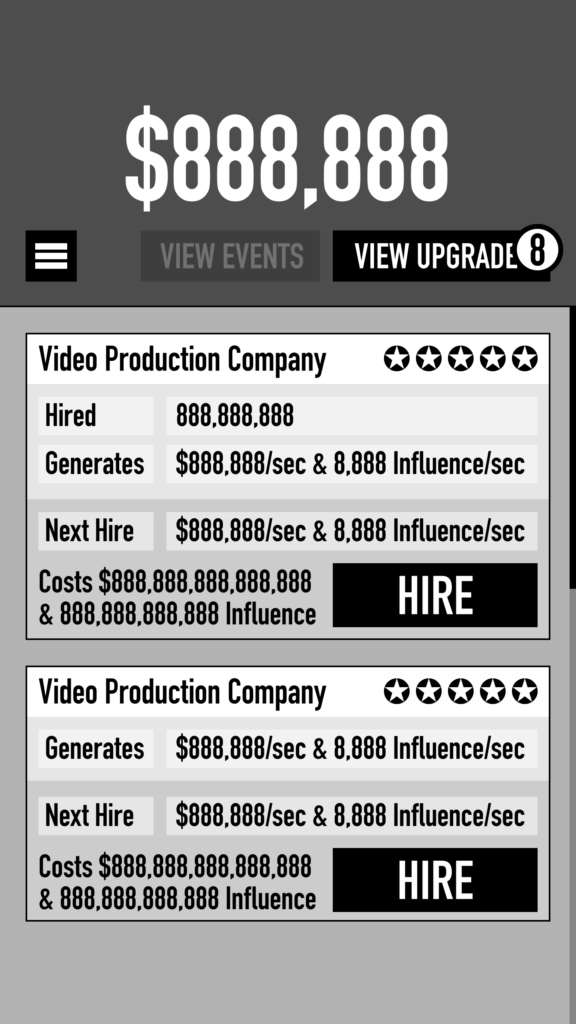
- The presentation of currency “generators” was the focal point of 90% of the interactions in the game. Aaron wondered if there should be images to represent each item to give them more interest and importance.
- For most currency “generators” a corresponding upgrade could exist that would multiply its output incrementally with each purchase up to a limit. Because every upgrade had the same number of progressions, Aaron wanted to explore a solution that would convey that upgrades were both possible and activated for each “generator”.
- Although the core game-play was mostly complete, Aaron was unsure if he would have personal time to work on optional features by the intended launch date, so it was moderately important for some of the screens to be flexible enough for future content additions.
02. CHALLENGES
- This was my first time using Unity’s native GUI system which has less intuitive properties compared to the third party NGUI plugin. Trying to maintain all of the pixel perfect margins and dimensions proved much more difficult because settings would sometimes get overwritten when parent objects were adjusted.
- The way Unity natively handles fonts in conjunction with strict object sizing is also more restricting than NGUI would accommodate. I was forced to choose mono-spaced fonts for the top area that displayed the two currencies which I had not intended because of animation and performance.
03. SOLUTIONS
In terms of complexity, Troll Farm is actually quite simple in its interactions which means the quality of the user experience relies more heavily on very subtle visual nuances. Fortunately, with this project, I could afford to devote more careful attention to font choice, the spacing between elements, and the hierarchy of information than most projects I have worked on because the basic foundation was already in place by the developer.
WIREFRAMES

For the style guide, I drew inspiration from political activism art such as that by Shepard Fairey and Banksy – my intention that core elements of shape and color might similarly bring to mind the era of WWII and propaganda posters.
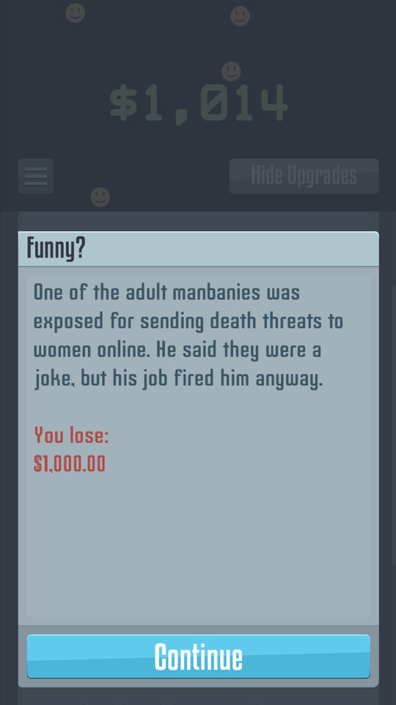
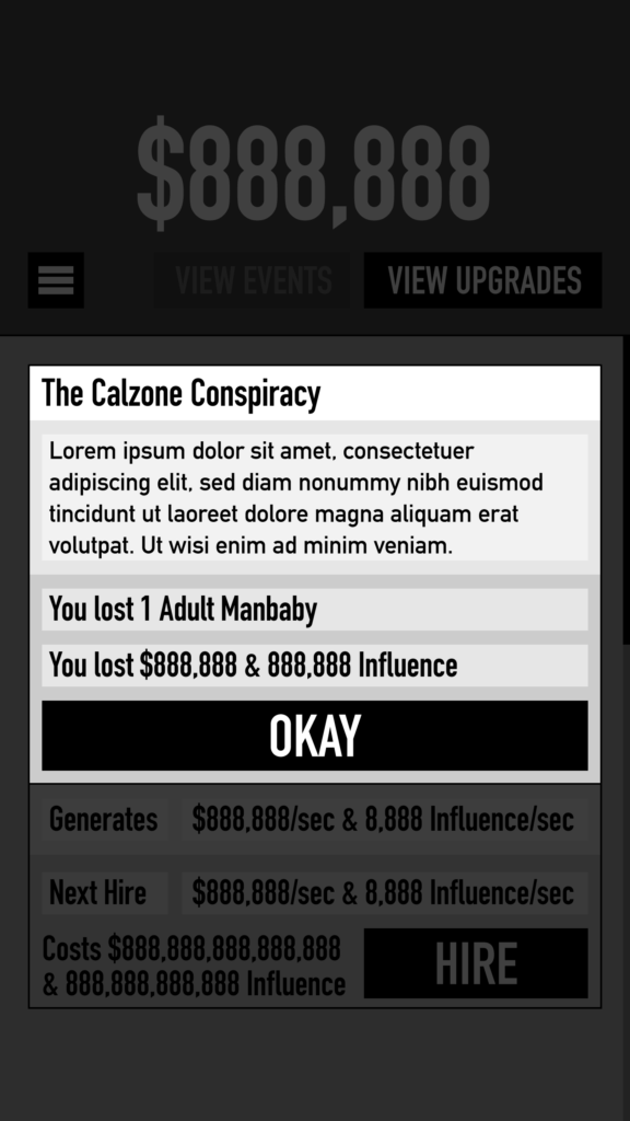
Because Aaron expressed the importance of the User actually reading the content, I decided that the UI format should remain very simple: less usage of images, giving more impact to when contextual events and animations occur. The scrolling content and simpler designs also helped me maintain the flexibility that Aaron wanted for adding features to screens in the future.
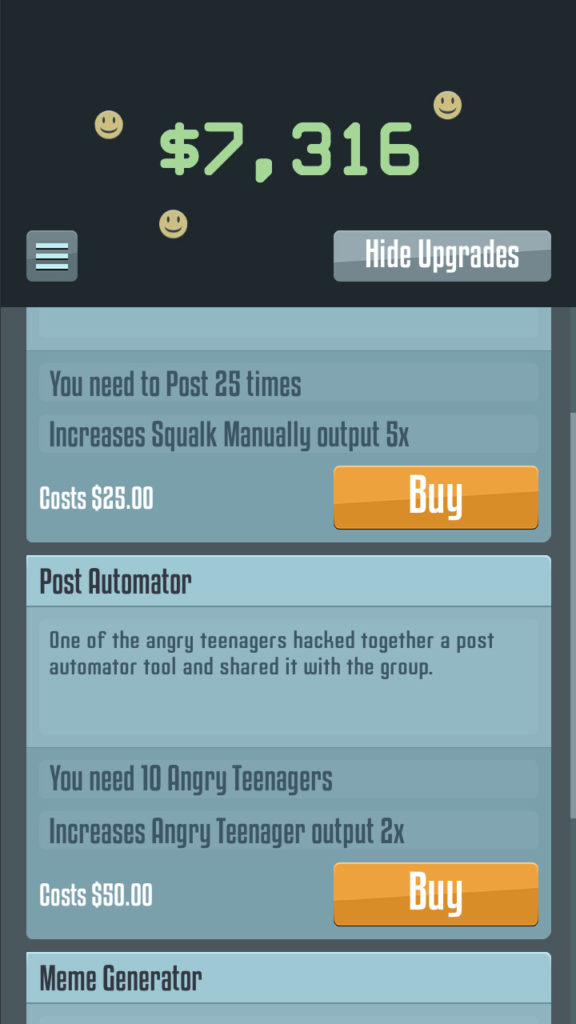
I suggested that the Upgrades and Options menus would appear more like their own distinct screens in contrast to how they were set up functionally in Unity 3D and also how they were styled before I started designing them. Although each screen has scrolling items that appear similar, the nature of their interactions should be visually different to the User. I made it so that both the color of the items’ panel and its button were distinct from one another (currency generators vs. upgrades vs. options).
I also pointed out the missed opportunity of notifying the User when new Upgrades were available with a numeric indicator on the “View Upgrades” button.
The addition of a star system (five stars, one for each upgrade) was ultimately what we agreed upon for conveying the hierarchy of Upgrades for each currency “generator” in conjunction with showing the new rate of output in place of the old rate for the sake of simplicity.
04. TIMELINE
Aaron’s personal goal was to soft launch Troll Farm onto the Apple App Store to coincide with the 2018 Midterm elections which gave us three to four weeks. Unfortunately, his personal schedule and other consultant work required more attention than he anticipated – he ultimately submitted the app for successful review in late November. My UI contributions to the project actually completed far ahead of the desired schedule, but I also helped provide quality control after updates up to final launch.
05. TECHNOLOGY
- Created using the Unity 3D Engine
- UI was managed by Unity’s native GUI system
- Version control was achieved with GitHub
- Daily UI reviews were done over Google Drive
06. RESULTS
As I anticipated, working with Aaron was uncomplicated due to our long history of developing games at previous studios. It was a pleasure to help him achieve the same level of product quality and development speed he came to expect from me, and also to learn some new processes along the way.